I found a diagram recently that helped to explain the different types of JOIN syntax. Being the type person that enjoys the visualization of abstract concepts such as set theory this diagram spoke to me. Despite the diagram being well done something seemed slightly wrong about it. I thought about it for a while and then it hit me: the diagram does not accurately reflect the complexity of joins for queries I see every day. The diagram seems better suited for a classroom, not the real world. So I decided to put together my own diagrams for you to show you the things I see frequently. You’re welcome.
1. The Three Table Join
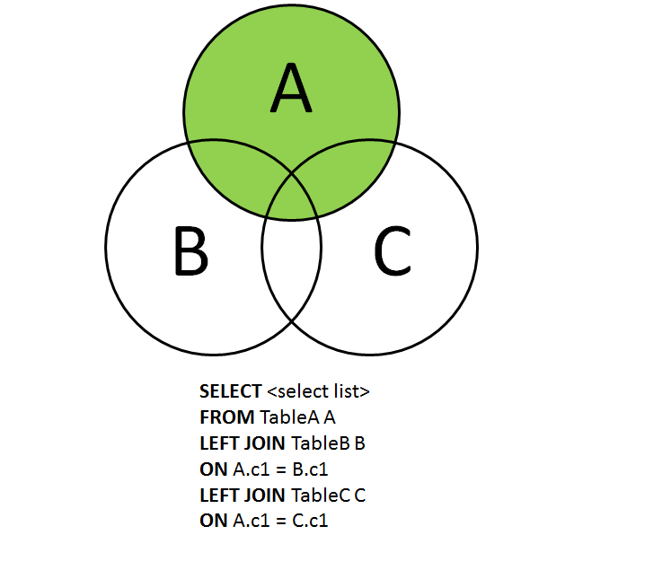
This first diagram that I thought about was a simple three table join. In fact, I was going to put together a new diagram for all the possible three table joins but decided that I really did not have the desire to put together 127 different diagrams (I am leaving it as an exercise for the reader to explain why I could need 127 different diagrams, leave your answer in the comments below). So, here is the first type of join I thought about:
What I find worth mentioning here is that you can change your result set by altering that second join. Instead of A.c1 = C.c1, change it to B.c1 = C.c1 and you will find that you may not return the expected data in your select list (another exercise for the reader there, go ahead and try that for yourself or you can just download this quick sample script).
Another fascinating point here is that it occurred to me that this same T-SQL would also apply to the following: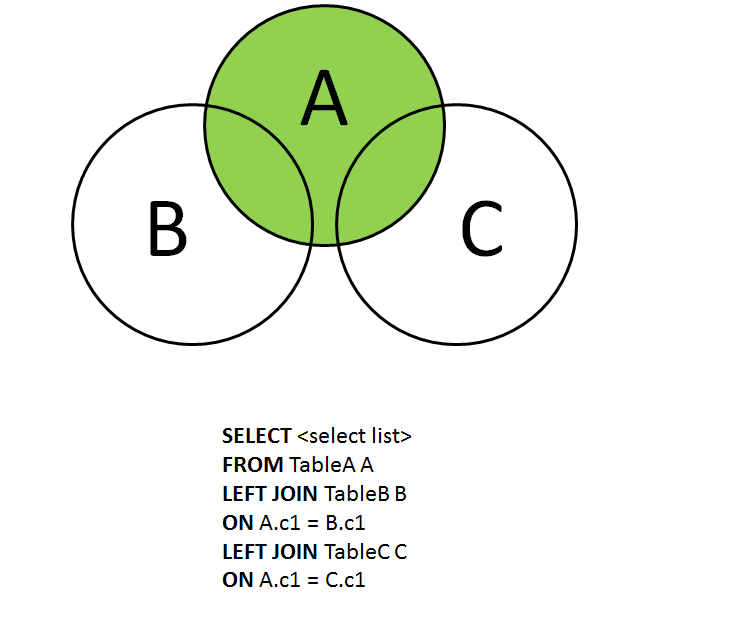
This diagram seems slightly more realistic to me, as I am likely to start with one table and need to go out to two (or more) other tables with joins.
2. The Table Join For Disjointed Tables
That idea got me thinking even more (always a dangerous thing) and I then thought about other types of joins I see frequently: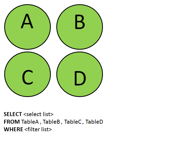
Yeah, that’s right…multiple tables with no relation between them. The end user just selects everything possible and then filters the rows based upon the WHERE clause or uses features in Excel or PowerPivot to do the filtering. In a way this is what I visualize “Big Data” to be, the grabbing of as much data as possible, mashing it together, and filtering the results until you find something that helps you get one step closer to wherever it is you wanted to go today.
3. The One Big Table Join
After that graph it suddenly occurred to me that there are a lot of people who create OLTP databases with really wide tables. I mean, REALLY wide tables, hundreds of columns. So, their syntax and graph looks like this: 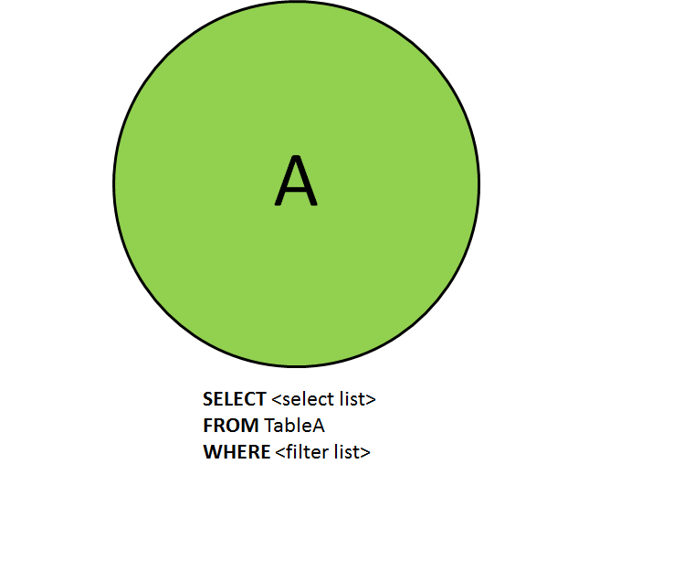
Everything in one table, what a perfect database design, right? What could be simpler than that? In fact most data warehouses are built this way, where they have a few tables that are really wide and you may not need to join to any other tables. All the more reason to point out how the original diagram was not very indicative of the queries I see. In fact, the last picture I have for you is the EXACT type of query I see all the time.
4. The “What Were They Thinking” Table Join
How many times have you seen code similar to the following? Ever try to draw the picture? Here is my visualization: 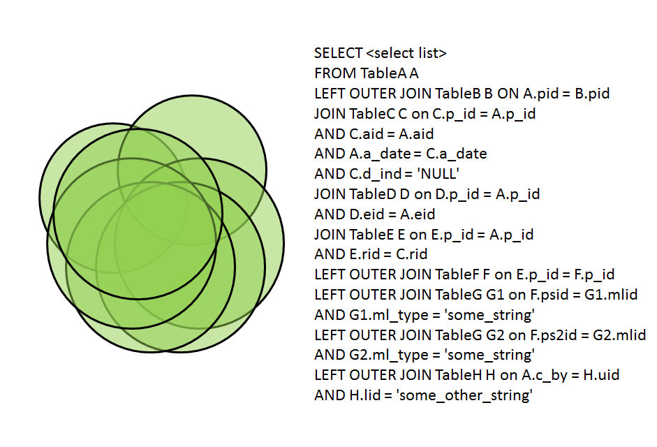
Yes, that’s right, I did include the infamous =’NULL’, don’t pretend like you haven’t seen that one before! I also included column names of ‘pid’ and ‘p_id’ to give you an indication about how we often see column names that aren’t very descriptive and leave you wondering if the columns are truly representing the same value type.
I think the above five diagrams are a lot closer in reality to the types of queries we see every day. And the types of queries we are expected to tune, often immediately.
I often find it easier to help with performance problems once I am able to visualize what the joins are representing. I bet your end users would appreciate seeing similar diagrams as well, it may help them to understand what they are asking for, and it would likely help lead to a healthy discussion about design considerations. If nothing else, it should help to level set the expectations for performance.


The possible combinations of joins are 3 combos each of inner and outer joins, plus an all table join, which is 7 ways of combining the joins. 2 ^ 7 = 128, minus the empty set = 127.
This is a great article. I’m coming to SQL from the PowerPivot perspective and I’m trying to develop my SQL skills to help improve the Power Pivot model so thank you for writing it.
I posted a question in the SQL forum about another type of model:
http://social.msdn.microsoft.com/Forums/en/sqlgetstarted/thread/fa66d65f-ae62-4afc-a6cf-399943b16426
I’m trying to understand LEFT/RIGHT more deeply!
Lee
Great article! Most of the explanations of sql joins present basic example with two tables. Your approach is outstanding!
The article: http://www.vertabelo.com/blog/technical-articles/sql-joins covers the basics of sql joins (there are venn diagram for each case and the example query with result). Your text is nice for further reading, that’s way I included it. I hope you don’t mind 🙂
Why use circles when actual tables are square and visualization would be better , basic thing but everyone copies instead of thinking originally
Well, “actual tables” are a logical representation of data that resides on a physical disk, and the concept of a table itself is meant only for humans to comprehend. A computer doesn’t say “this is a table, and it’s a square”. It’s just bits on a page on a disk.
I guess I’m used to standard Venn diagrams where circles represent sets. And a circle works just as well as anything. Feel free to redraw the diagrams using squares, I’d be interested in seeing lots of different shapes used. After many years of mathematics I’ve never thought about using anything but circles to represent sets.
Thanks for the comment.
Tables are not square – they are actually data. One common visualization of them uses boxes with square corners, others use boxes with rounded corners, and others use circles. “Circles and lines”, the lingo of some trolls originates from these earlier data models of tables and relationships.
But yeah, math class is hard.
I know how actual tables are represented in computers. The reason I
pointed is when I was looking closely at those Ven diagrams for the
first col second fig or last col 2 fig the last line states where A.key
= null . But I could not figure that from the ven diagram. I switched
to a “tabular” diagram and it popped. Thanks for taking the effort to
explain it in the first place. sorry but I did not mean to be
commenting negatively.
Thanks for the follow-up comment, and I agree that a different visualization would be helpful here. I’m now thinking about a way where we could use layers in order to better picture the join syntax.
LMGTFY https://www.google.ca/search?q=set+theory
Thanks for the suggestion about set theory.